- March 11, 2023
- Posted by: Daria Krutkova
- Category: Blog

How to Make a Pie Chart in Google Sheets: Simple Step-by-Step Guide!
Pie charts are a great way to visualize data in Google Sheets. Pie charts can help you understand how the data is distributed, and they can be used for comparisons, such as comparing sales figures for different regions or the performance of various products. Pie charts are easy to understand, and they’re fun to create! Well, it’s only fun if you know how to create them. The best thing is that it doesn’t matter if you’re starting or have been using it for years. Both newbies and power users will find it easy to learn how to make a pie chart in Google sheets. Here is a step-by-step guide that will teach you how to make pie charts, style them, duplicate them, and so forth. By the end of this article, you should be able to make pie charts in no time.
Step-by-step guide
Pie charts are excellent for showing data volume, distribution, and overall shape. But pie charts can be tricky if you’re not familiar with how to make them. In this guide, you’ll learn how to make a pie chart in Google Sheets. You’ll start with a template that includes everything you need, such as data. The result is a beautiful pie chart that perfectly shows your data!
Where to begin?
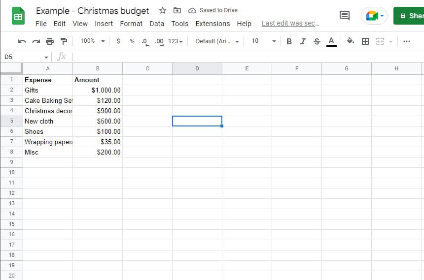
 Start by opening Google Sheets, of course. To do this, log in to your Google account and navigate to Google Spreadsheets. Once here, click on add a new document as shown below. Next, you need to create your data. You need to key it in the spreadsheet if it’s a budget. Start by labeling your columns, then enter the data. If you already have the data while reading this article, then skip this procedure and go straight to the spreadsheet with your data. For illustration, we are going to use the following data. Note that this is an illustration and not an actual Christmas budget.
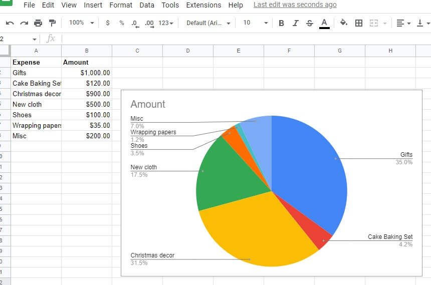
 Next, select all the data you have entered. Use your mouse or CTR + A on your keyboard to do so. Head over to the “Insert” tab on your spreadsheet. Tap on it and select “Chart.” Google sheets will automatically guess the best chart for your data set. It could insert a bar chart if you have multiple rows and a pie chart if you have two rows. In our case, it automatically gave us a pie chart, as shown below:
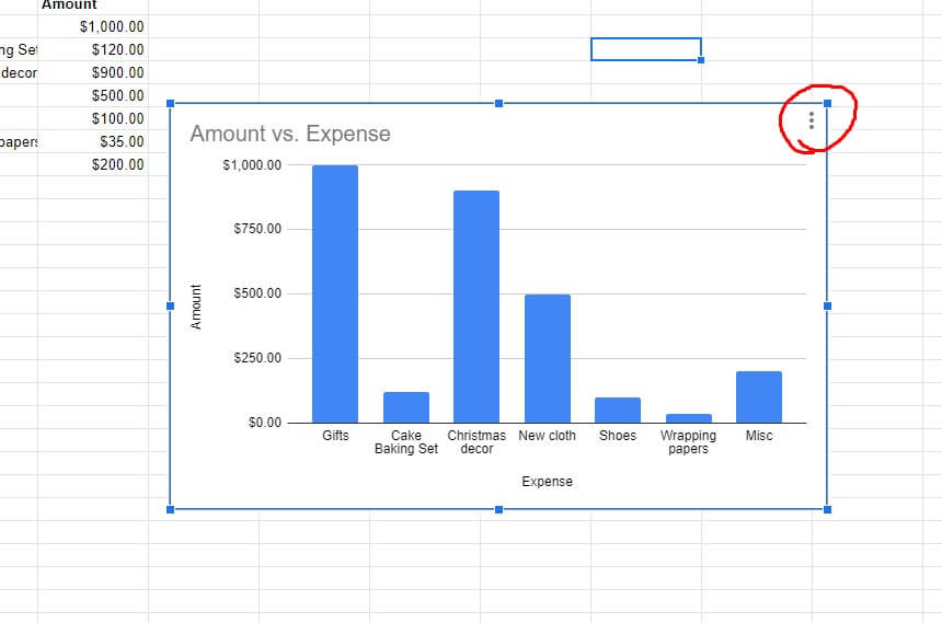
 The chart above was automatically generated, and we never specified colors, fonts, or anything else. You could change it in a few steps if you didn’t get a pie chart automatically. We will assume that a bar chart was generated instead of a pie chart. The first step should be clicking on the three dots on the top corner of your bar or graph, as shown below:
 Next, tap on “Edit chart” from the pop-up menu. Under “Chart Type,” change it to Pie Chart. Your graph or bar should now be a Pie Chart.
Editing the chart
As mentioned earlier, Google Sheets will automatically generate a chart for you. Sometimes the generated chart could be messy and out of expectations. You can change every aspect of that chart until you get the desired results. To edit your chart, you need to tap on the chart and select the three dots in the top right corner. Tap on “Edit Chart.” This action will open a menu on your PC’s right side, as shown below:
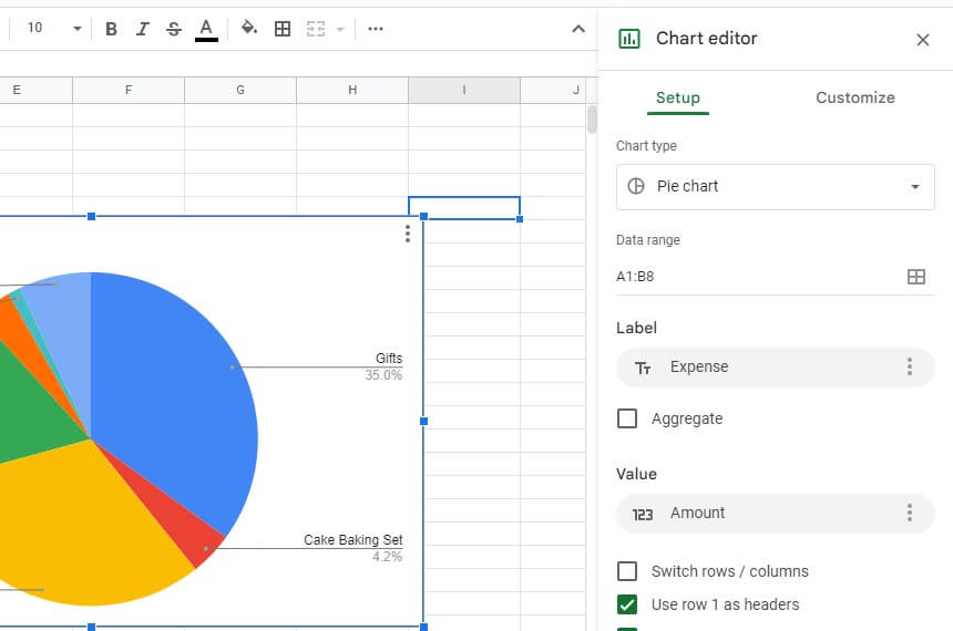 If the generated chart has mixed up the values, you can change the data range via the following procedure:
- Scroll down on the customization pop-up from the screenshot above.
- Under “Data Range,” click on the box shown below.
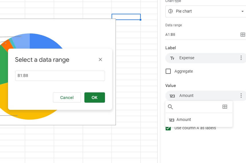 A pop-up will appear, prompting you to select the data range. Manually type in the range or use your mouse left click to highlight all the cells you need to include in your pie chart. Once done, tap on the “OK” button, and your chart will automatically update.
To change your pie chart label, use the steps below:
- Go to the customization menu illustrated above
- Under the “Label” option, choose the column that will be your label from the drop-down menu
- Your chart will be automatically updated
To edit the chart title, use this procedure:
- Click on the chart once
- Double-tap on the title
- Delete the current
- Type in your new title
- Customize the font style, type, and weight as needed
If there is any data you have captured incorrectly, all you need to do is edit it, and Google Sheets will update the chart automatically as long as you have an active internet connection.
How to make it look clearer?
 The pie chart in Google Sheets is an excellent method for visualizing data and making comparisons, but it can be hard to get the charts looking just right. Luckily, you can customize the pie chart to meet your visual expectations.
Take a look at how your pie chart looks on its own. It probably looks messy—the slices overlap each other, and there’s no clear division between them. The colors used might not be your favorites, and so forth. Here is how to make the chart beautiful and clearer:
- Changing background color: You can also change the background color of your pie chart from the Customize tab. Under the chart style, click on the “Background color” box. Choose the color you want to be your chart background. If you need a more specific color, choose “Custom” at the bottom of the pop-up.
- Changing font: Your pie chat will inherit your data set’s font type and style. If you need it to have a different font style or type, go to the Customization tab, then choose Chart Style. Change to the font you need, style, and weight.
- Changing border color: If you have multiple charts, you might want to separate them with borders. This allows for visibility and prevents confusion. You can set the border color of your pie chart under the ‘Chart Style” tab from the previous steps.
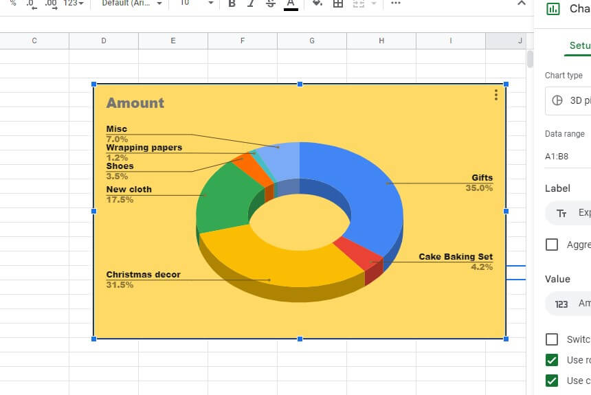
- Doughnut radius: To set up this shape in the middle of your chart, go to Customize tab and then select “Pie Chart.” Under this option, you can set the radius in terms of percentages. Set up the border color, label font, format, text size, and color.
- 3D: If you need a more visually appealing chart, you can change it to 3D by checking the 3D box. However, we do not recommend 3D charts as they are hard to interpret and read.
- Maximize: This option removes all the labels from your chart and takes them to the upper right side of your chart. Since there are no labels around the chart, there will be lots of space for it to expand and become larger.
- Legend: This option allows you to move your labels to the top, left, right, or bottom of your pie chart. You can also adjust the font, size, and style of your labels.
- Editing individual pie: Click on the pie in question, and a menu will appear on the right side of your PC screen. Change its color, distance from the center, and so forth.
How to make a double pie chart?
 Use the following procedure:
- Once you have the data set, select the “Insert” tab
- Navigate to “Chart,” then “Chart Type”
- Select “Doughnut Chart”
- Go to the “Customization” tab
- In the “Chart Styles,” set up the doughnut radius
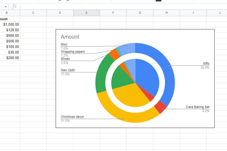
- The first chart should have a radius of 25%, while the other 75%
- Arrange the pieces so that your double pie chart looks professional
- Adjust any other aspects of the double charts using the procedures captured in this write-up
How to make a Google sheets pie chart on iPhone and Android?
The Google Sheets app is available for iOS and Android, so it’s easy to download and use on your phone. The first step is downloading the app. You can find it in the App Store or Play Store by searching “Google Sheets.”
Once you’ve downloaded it, open it up and sign into your Google account. Then follow the instructions to set up a new spreadsheet. Inserting a pie chart into Google Sheets on your iPhone or Android device is a breeze!
- Type in your data
- Highlight the data and tap “Insert”
- Select “Chart” and tap on the pie chart from the list of options. It will automatically insert a pie chart into your spreadsheet
- For additional edits and customizations, use the procedure covered above
Final Thoughts
Pie charts are the way to go when you’re trying to get a handle on a data set and make sense of it. Pie charts are easier to interpret than bar graphs or line graphs and are more accurate than most other chart types. Pie charts can be used for anything from designing a marketing plan to better understanding your revenue streams.
The best part is that they’re relatively simple, even if you’ve never made one before. To learn how to make a pie chart in Google sheets, you only have to enter the data you want to visualize. Once done, go to the insert tab and click on charts. Google sheets will probably insert a pie chart automatically. Customizing your chart is also a walk in the park. All the customization options are easily accessible by right-clicking on your pie chart.
